
Bringing Clarity to Public Transportation with Color
In the United States, buses are the overlooked workhorses of daily transportation. While trains and planes often get the spotlight, buses actually move far more people each year when measured by total boardings. (Source) In 2023, U.S. transit systems recorded nearly 7 billion unlinked passenger trips, with buses accounting for roughly half of those. By comparison, Amtrak carries around 33 million riders annually, and commercial airlines, while moving hundreds of millions of passengers, still fall short of the number of boardings buses handle every year.
The story shifts, however, when looking at distance traveled. Airlines dominate in passenger‑miles, as each flight covers hundreds or thousands of miles per trip. Trains, though covering longer distances than buses, carry far fewer passengers overall, making their contribution to total passenger miles relatively small. In other words, buses win in moving people in large numbers, particularly for short, everyday trips, while trains and planes are critical for covering long distances efficiently. This makes buses an essential, yet often overlooked, backbone of daily American transportation.
One reason buses remain underused or underestimated is simple: many systems can be hard to understand for inexperienced riders. Service networks are vast yet invisible and routes easily blur together for riders, especially for visitors or infrequent users. Common questions are:
- Where does this bus go?
- Is it local or regional?
- Does it run frequently or only occasionally?
- Is it meant for short trips or long ones?
Among several tools to help answer these questions, the simple use of color coordination can become a strategic tool.
Color as functional clarity
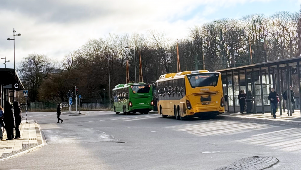
Many agencies demonstrate how intentional use of color can communicate function. Across southern Sweden for example, Skånetrafiken (the county transit agency) applies a consistent visual language across its services, buses and trains alike, reinforcing the idea of a unified, legible public transport system. The colors aren’t decorative, but clarifying. It simplifies public transport at a glance, across modes, geographies, and service types, through clear visual and information design (including related marketing information), ensuring that riders can distinguish between local city buses (green buses), regional buses (yellow buses), and rail services without needing deep system knowledge. This approach reflects a broader design principle: reduce friction, assist the user, and let the system explain itself.
Color signifies service function, not just agency branding. For Skånetrafiken:
- Green buses: high-frequency, all-day city routes, great for connections.
- Yellow buses: longer regional and inter-city services
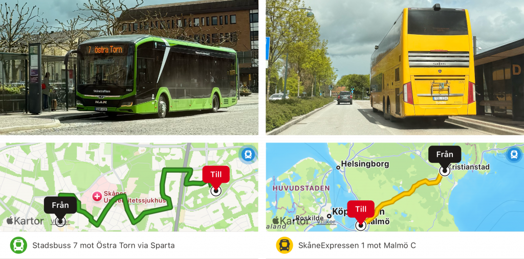
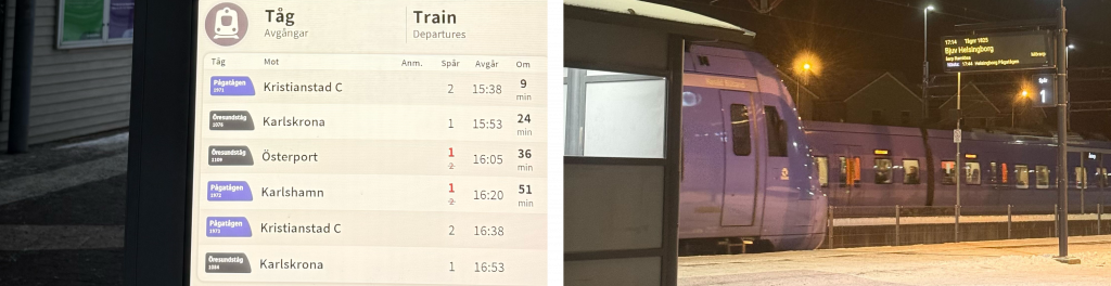
The same logic also extends to rail services:
- One color family for local rail (Purple)
- Another for regional or express trains (Grey/Silver)
Applied consistently across a large county, this instantly answers key rider questions without needing text messages or apps. Green means “show up and go local.” Yellow means “longer distance, fewer stops.” If there’s one bus stop, but two different colored buses, this answers one important question immediately for inexperienced riders. This mirrors best practice in transit wayfinding and cartography, where color reduces cognitive load and accelerates decision making at moments of stress for transfers, first-time riders, and travelers in unfamiliar places.
Why this matters
Color consistency and coordination supports several critical issues:
- Reduces cognitive load — the brain processes color faster than text, enabling almost instant recognition.
- Supports tourists and infrequent riders — people who don’t know service route numbers can still understand simple color cues.
- Makes the system usable without an app — essential for equity in the physical network (e.g. older people, younger people & anyone without a smartphone).
In regions like Skåne, where buses already carry large volumes of daily trips, it’s about respecting existing and future riders and making a successful system even more effective.
The bottom line
Buses don’t need to be a backup transportation mode. They can be the primary movers of people providing sustainable and efficient transit service at scale. If we want to support mode shift, equity, and systemwide efficiency, we need to start treating buses as the essential transportation and making improvements to make bus services as frequent and easy to use as possible. This also means designing bus service networks with intentionality and in tandem with other modes of transportation.

Want to work with us? Feeling inspired?
Contact us at info@dcrdesign.net or checkout our social medias: LinkedIn, X and Instagram